Here are some photos I took the past couple of days, either on a walk or driving in the car. Photo’s are taken on my phone and edited in Lightroom.


Here are some photos I took the past couple of days, either on a walk or driving in the car. Photo’s are taken on my phone and edited in Lightroom.


The style of photography I’m interested in is fashion photography.
A person of interest in this field of photography for me is Alex Waber. I love his work, his photos are really unique and capture your attention really easily.


The benefits of this type of photography are that it’s very popular, it’s timeless and there’s always something new.
To train for this profession you can easily sign up for classes and learn from professionals. Even just watching YouTube videos and practicing could get you really good.
For this style of photography, you would need to get models to shoot with. You could go to fashion shows, or if you could have your friends or hired models to dress up for a shoot.
I would be able to pay for this with the savings I already have and with help (hopefully) from my parents.
Disadvantages of fashion photography is that it’s very fast paced and can get stressful quickly.
The equipment required for this would be, of course, a camera. As well as a tripod and some lighting.
My Photographs:
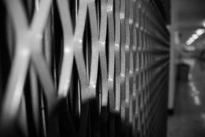


Aaron Siskind:

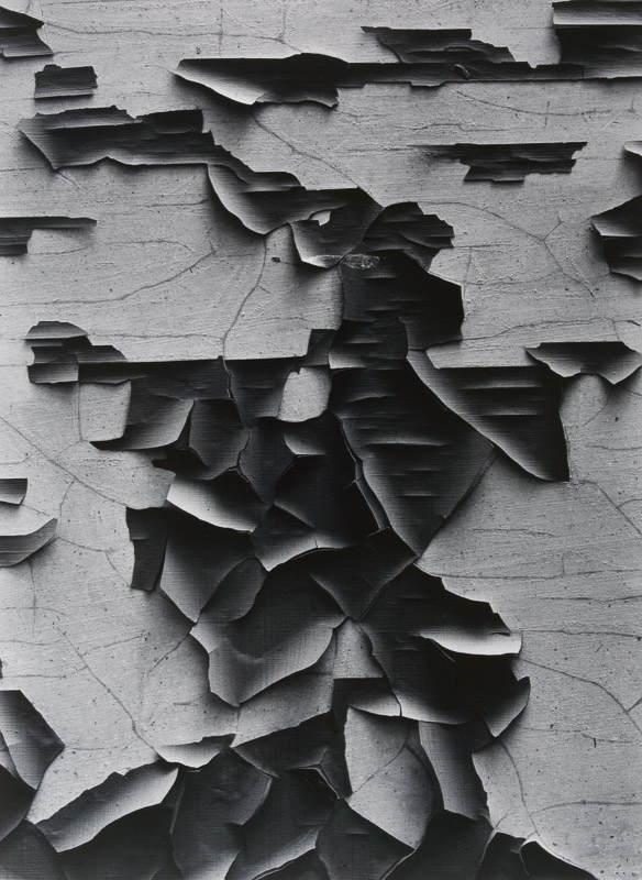

Looking into the photographer Aaron Siskind, I’ve seen a lot of similarities in his photos. He has a monochromatic theme and his pictures show a lot of texture. Personally, I love his photographs. It’s very abstract and unique, almost looking like some of these lines are coming at you. I chose these 3 photographs based on what I found most interesting to look at.


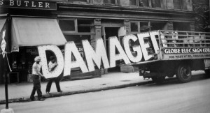
Description:
This photograph shows workers in New York City loading a neon “Damaged” sign into a truck. The ‘subject’ of this photo would evidently have to be the sign. The large letters draw a lot of attention, really canceling out anything else at a first glance. It is taken in front of, what looks like a corner store for groceries.
Analyzation:
The street in this photograph seems surprisingly empty for one in NYC. The black and white also adds to this sense of a gloomy image. Walker Evans took this photo at eye level but with the damaged sign crooked while the two men are still loading it into their truck. This is another aspect of the photograph that adds to its effectiveness.
Reflect:
When you look closely at this photograph, you can see that one of the men carrying the damaged sign is shirtless. As you look further into the photo, you see that all the windows in the building behind them are open, clearly stating that its a hot summers day. I think Walker Evans took this photograph to show that like the sign, the workers are damaged as well. They look tired and at that time they probably weren’t getting paid much money for their heavy lifting. It’s a take on how they felt at that time; damaged.


These are the 5 photos I chose to share for the Lights and Shadow assignment.
– G. Garcha
ISO: 1250
APERTURE: 2.8
SHUTTER SPEED: 1/20
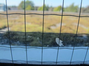
ISO: 250
APERTURE: 4.0
SHUTTER SPEED: 1/500
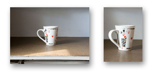
On the left side, we have an example of a boring picture. There could be confusion whether the center of attention is suppose to be the mug or the edge of the table since its so distracting. There’s a glare on the mug and you can’t really see the design made on it.
On the right side, we have a close up of the mug. Here, it’s clear what the focus is of the picture. It’s also angled to give the picture a little more flair. The right picture is clearly much better than the left.
#1)The five intellectual assets are patents, industrial designs, trademarks, copyright and trade secrets. Here is a brief summary of each:
#2) Public Domains: WikiMedia


#3) Creative Commons:
 Attribution
 Share Alike
 Non Commercial
 No Derivatives