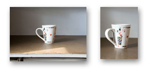
On the left side, we have an example of a boring picture. There could be confusion whether the center of attention is suppose to be the mug or the edge of the table since its so distracting. There’s a glare on the mug and you can’t really see the design made on it.
On the right side, we have a close up of the mug. Here, it’s clear what the focus is of the picture. It’s also angled to give the picture a little more flair. The right picture is clearly much better than the left.
Heeeeeey you did a great job of explaining ;*
Hi, it’s Bruce. The photo is used from my website and thanks for using it in your assignment. Glad it helped!
Cheers,
Bruce